Translated by Google. I’ll be revising and editing all Blog posts soon.
Typography simply means “patterning letters” or, to put it more simply, “playing with letters.” I remember a toy (probably the same name as the letter game) that had a white perforated board as a whiteboard and lots of tiny colored letters that went into these holes and fit together to make words and sentences. At that age, no teenager had even heard of typography, but the action that was being performed was a very simple and primitive form of this action. Just as humans thousands of years ago, when they created the letters of the alphabet one by one, did not know that in fact today in this article we are going to call them “reverse typographers”!
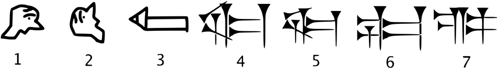
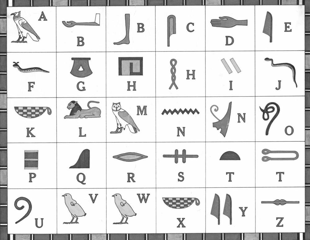
Humans have been searching for ways to communicate with each other for many years, and after meaningless sounds and syllables, they finally achieved a “language” in each region. A language that now facilitated “communication” through a series of “contracts” between them. No one knows who made these agreements and why everyone accepted them. Even how they were established among less civilized humans arouses human curiosity. After a while, these languages revealed the necessity of creating a written “mediator” and “prophet” more than ever before. Now, in the next step, humans want to write down their orders, regulations, biographies, feelings, and mental emanations. At this stage, pictorial and open “contractual” and also ethnic and regional symbols gradually formed and after the existence of pictorial languages, led to the development of a completely and conceptually new and immediate product called “alphabet”. The surviving examples of the first signs refer to the early cuneiform alphabet and the Egyptian hieroglyphs . (Figures 1; Evolution of the cuneiform alphabet and 2; Hieroglyphic alphabet)
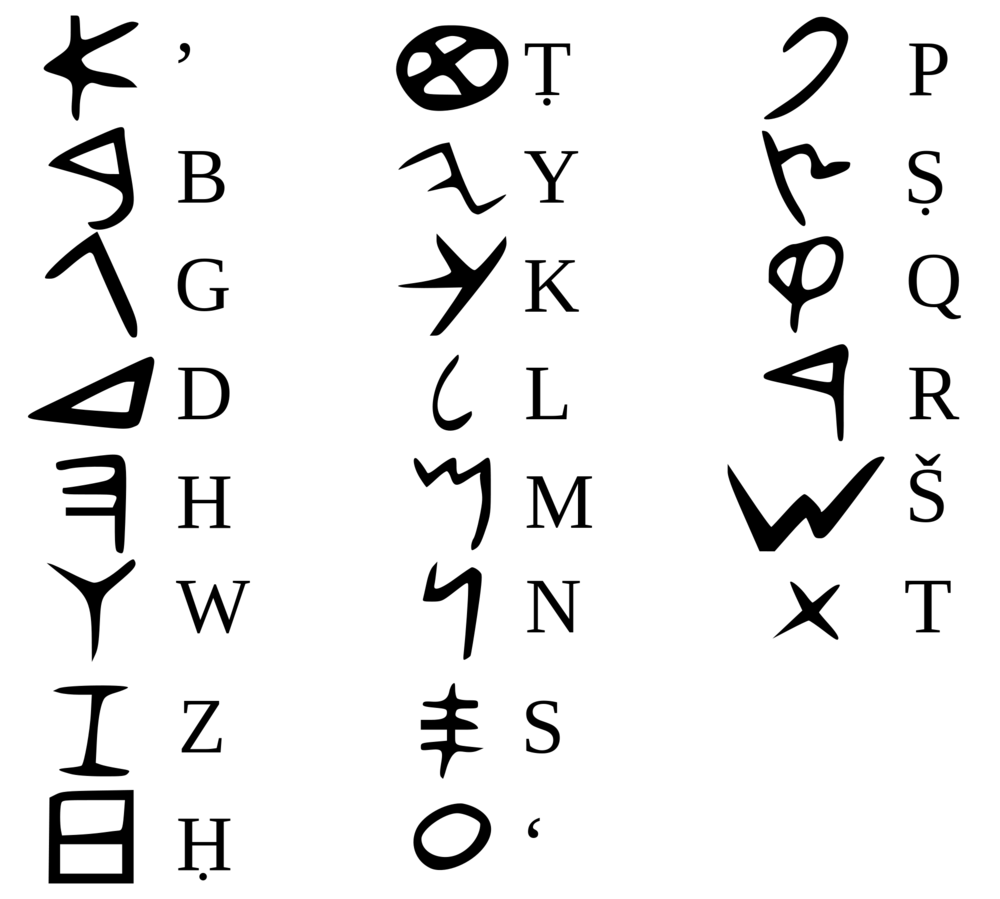
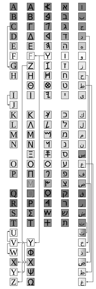
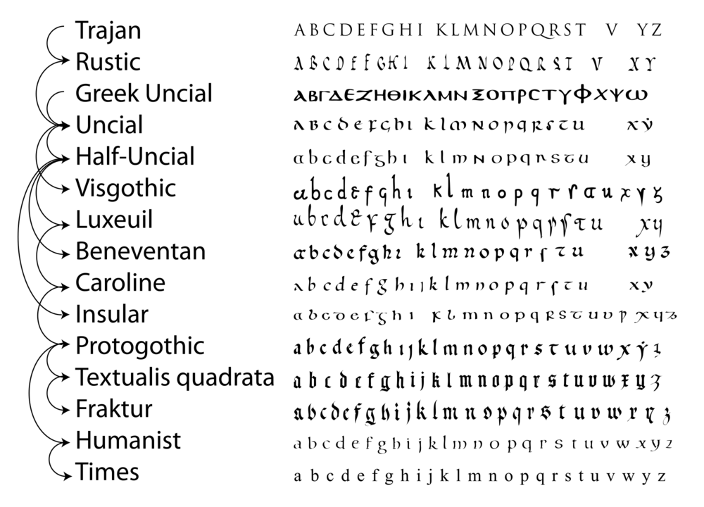
Later, the first official and common alphabet in history was invented by the Phoenicians (Figure 3; letters of the Phoenician alphabet), which over time and later, with almost all alphabets originating from this initial alphabet, led to the creation of the first “true” alphabet (fully including consonants and vowels with the same and understandable writing style, and not just the abjad like the Phoenician alphabet), namely the Greek alphabet and then the Latin alphabet , which has remained intact to this day. (Figures 4; from left to right, the letters of the Latin, Greek, Phoenician, Hebrew , and Arabic alphabets , emphasizing the key role of the Phoenician alphabet in all of them, and 5; how the Latin letters evolved.) Therefore, I call the humble creators of the alphabet “reverse typographers” who, by selecting and addressing a specific symbol and sign to a “letter” (or in some languages, a “syllable” or “word”), have gone from a meaningful visual symbol to a meaningless fixed symbol. For example, if the symbol “flamingo” means bird, flight, wings, sky, freedom, etc. to everyone, then assigning it to specific letters with a concept like “red” is an action that is interpreted in exactly the opposite direction of typography. (Alphabet: Image > Lines > Character. Typography: Letter > Lines > Image)
In other words, in the process of creating the alphabet, symbols and signs were transformed into letters that could later be used to write new texts. But in typography, letters are changed during the writing of texts to create a new concept or a different and sometimes hidden image, so that they become “shaped” and become visual. For example, when a typographer shapes the letters of the word “bird” in such a way that the shape of “bird” is “also” associated, his action is the killing (anti-creation) of the alphabet. (Even the inherently meaningless black letters are anyway considered visual elements rather than letters of the alphabet.)
In the author’s opinion, this is a very interesting case, and at the same time, its expression is perhaps like the famous proverb: “Once a puzzle is solved, it becomes easy!”
What a vicious circle! If one day, a human incapable of communication, beyond drawing flowers and nightingales, uses all his power and presents an exceptional product to the future generations that will become the alphabet of all writing, now thousands of years later, artists are thinking of extracting visual and conceptual forms from these same letters of the alphabet that are no longer “just letters” and have something more in themselves (perhaps images and shapes). Perhaps one of the most famous examples is the Eye Bee M typographic design for IBM, which, from the perspective discussed in the above lines, can be reminiscent of hieroglyphic inscriptions! It seems that the designer has been tired of conventional letters for years and has now returned to what our ancestors have been running away from. Just as a flamingo symbol was interpreted as red in hieroglyphics, here a bee symbol is addressed to the abbreviation B. Of course, we know very well that one of the clearest and most prominent signs left over from ancient times is the “logo”. The symbol of placing a conventional shape for a profession, profession, person or region and ruler of the government. This procedure is still used in the modern era and after for all the giants of industry and science and manufacturers and…. Four circles represent Audi and this is also the most similar type of interpretation to things like flamingo for red.
It goes without saying that the alphabet has also made its mark on the flow of visual communication in the field of logos and signs! The alphabet has gradually dragged itself into logos and has created monograms and logotypes throughout history. It seems that it wanted to push aside its ancient rival, the “image,” and open its way into the minds of mankind. And centuries later, it has given the letters V and W together for the “sign” of Volkswagen to the people of today! And it is not far-fetched to claim that these same written signs, which may have been used in seals and signatures for thousands of years, have gradually penetrated signs and logos and have since laid the foundations of typography in its present meaning.
But has humanity regressed in this regard? After thousands of years, has it returned to square one? First, it used shapes conventionally, then it summarized and condensed them, made an alphabet out of them, and now it “shapes” the alphabet again in some way to achieve something more, while it already had that something more?
This conclusion does not seem fair. First, thousands of years ago, humans used the alphabet for everyday communication and basic issues, while today’s typographers are involved in complex business and advertising matters with the aim of attracting “customers” and “buyers”. If they achieved conciseness, it was only for the convenience of work and speed in the writing process, but they consider the artistic aspect and the factor of influencing the audience. Second, professional typography is not always “just” turning the word bird into the shape of a bird, and in many cases, it is about giving shape and an aesthetic look to the letters. Therefore, putting primitive human forms and today’s “shaping” in the same category makes the scales tremble!
Here comes another sweet discussion: “translation”. We talked about human efforts to communicate, and about the creation of language and the visual alphabet and its abbreviation in the form of a written alphabet. (Which in itself uses completely meaningless letters. For example, by seeing the Persian letter “B” or the English letter “T”, no “meaning”, “concept”, or “emotion” is conveyed to us. Letters together form words, and those words convey “meaning” based on the “language” that we have learned over the years.)
Was this the greatest mistake of mankind? Turning the alphabet into something that had no meaning in itself and cutting off the possibility of communication with other peoples, nations, and their languages? If the alphabets had remained pictorial, would different peoples have been able to easily learn languages and communicate with each other, in addition to increasing the speed of learning? Now we know that this is not the case and that this process was inevitable. The volume of shapes and pictograms and the space they occupied, the slow speed of writing in that state, as well as the need for new phrases and words, concepts, corrections, and emotions, which increased in number day by day as humans learned more, made the path narrower and narrower. The only solution was brevity and brevity, and its side effect was the increasing number of beings called “translators.”
We may never understand how the first generations of translators understood each other’s words when there were no reference books, encyclopedias, dictionaries, or a third language to refer to. (For example, today it is possible for a translator to know languages A and B and another languages B and C. In this case, a semantic connection between A and C can also be established with the help of language B. But in the beginning and the first generation of human linguistic communication, even this bilingual translator did not exist because the different languages and peoples remained and developed as strangers to each other.)
But it can be assumed that gestures and pointing and drawing shapes were the key to this path. Translators would translate languages and then alphabets into each other, and the nation’s affairs would go well, and centuries and centuries passed until humanity finally came to the conclusion that if it chose one language as an international language, many issues would become easier and the process of understanding and comprehending things, sayings, and writings would be greatly accelerated. Perhaps one of the reasons for the delay of several thousand years for this event can be found in the cultural, ethnic, and religious differences and the more difficult and consequently less communication between human societies. Perhaps it was the Industrial Revolution and the French Revolution that created the tremendous waves of change in human society. From the faster connection of cities with the help of science and trade and more travel to more cultural communication. Gradually, humanity realized this truth that had been neglected in the depths of history: “Monolingualism is better than multilingualism!” Initially, French was chosen as the international language due to the tremendous impact of the French Revolution on European societies and even the world. (Of course, the American Revolution occurred earlier than the French Revolution, but the Americans were not able – or did not want – to introduce their revolution as a model to other nations of the world. This spirit of self-importance and pride was more visible in the French, which promoted the spirit and way of life, as well as the French language in the world.) Later, of course, the power of Great Britain and perhaps America – its great language partner – grew stronger, and how happy we are that now, instead of French, the English language provides communication between millions of people, makes it possible to read the world’s news and current affairs in books, publications, audio and video networks, and the Internet, and makes it understandable to benefit from the huge entertainment industry of Hollywood and satellite networks.
Humanity has come a long way, from syllables and sounds to language and visual alphabets and written alphabets and translations and now international language and alphabets. But why does humanity always have such difficulty communicating? With all these tricks and different ways over thousands of years, we still have typographers who need something beyond international language to improve this communication in the shortest possible time: “shape”. Whether in logos and logotypes or in posters and music covers and book covers, typography still tries to get help from shape so that, for example, by adding a few circles resembling body heads to the word Families, it can convey its message faster and more concisely. The designer knows that now, with the spread of English as an international language, the majority of people are able to read and understand the meaning of the word Families, but he sees complete communication as established when he comes to the aid of his writing with a “shape”.
What is the point of all this juxtaposition and all this effort by designers and typographers? In the field of verbal communication, humanity has almost reached the end of its path. Translation software and sites like Google Translate now translate different texts of most of the world’s living languages into each other in a fraction of a second, and with the advancement of technology, it is not long before they can create smart apps and programs that, using simultaneous recording of the other person’s voice, instantly translate their speech into the target language. Now, humanity’s dream is slowly coming to fruition. Uninterrupted and permanent communication with every other living being. The only problem is that this type of communication still “needs” to predefine all the letters, words, and terms of the written alphabet. This means that once the meaning of a word is removed from the Mongolian language dictionary, no English speaker can understand its meaning after looking at a Mongolian word for a thousand years. This is what we mentioned earlier; The letters of the written alphabet have no meaning in themselves because they have been completely stripped of their original “shapes” and only a few lines and dots remain.
Now we ask our question again? What is the purpose of all this juxtaposition and all this effort by designers and typographers? Maybe that’s why! If you can add a hidden or obvious meaning and concept through the art of typography to a collection of letters and words derived from an alphabet that is meaningless in its essence, you have been able to create a work that is not (just) a combination of letters! A work that perhaps even if we take the letters of the alphabet from it, gives us its hidden and visual meaning in the form of the “shape” it creates, and perhaps this is the very purpose of typography: the undisputed master of all alphabets and their historical conventions, the compensator for humanity’s historical failure to eliminate shapes and images, the reviver of understanding concepts based on their image and not a few lines and dots!
And if today’s humanity were not so preoccupied with names of places, cities, countries, addresses, phone numbers, and in general “proper names” (phrases and words that cannot be translated visually and must be presented in text form in order to be understood and “read,” and perhaps art through typography is the only way to return to the beautiful visual era of the past, meaning to benefit from “form.” Art in its world does not require us to say “much” and there is an “opportunity” to read slowly and continuously, so that in the “rush” of the modern world we are not forced to summarize and rush in writing and communication. A little pause and hesitation to “enjoy” and not “just” write quickly!), one day, humanity would completely return to its visual alphabet.
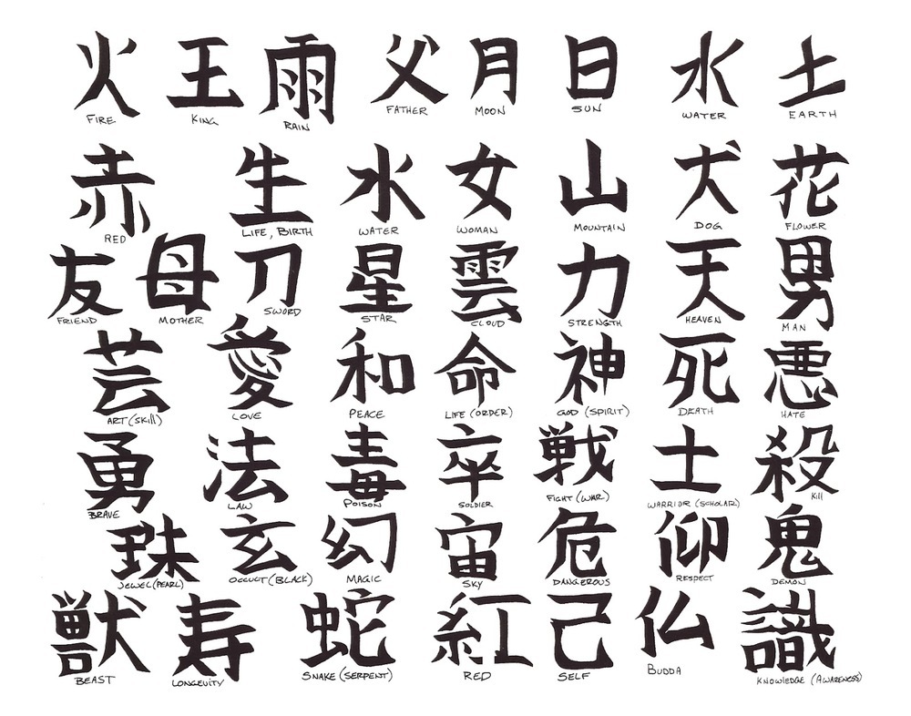
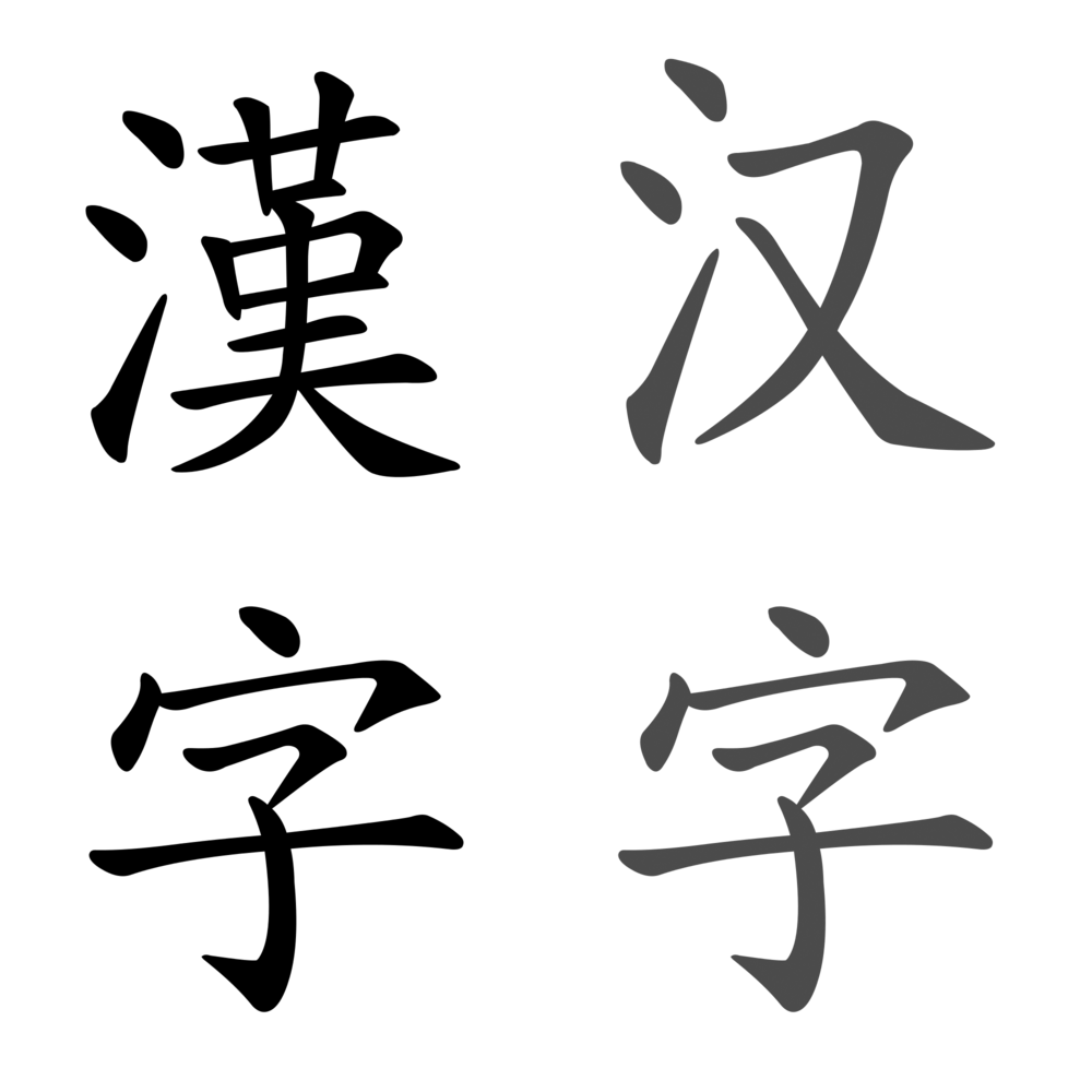
We know that the reason for all these human sufferings is communication, and in the field of typography, this communication goes directly to potential clients and customers. In many cases (and perhaps more so in Iran), these clients do not give the slightest importance to the typographer’s juggling acts and only want to be able to “read” words and sentences and “understand” the address and telephone number of an event or concert, or the title of a book or movie, or the name of a company or organization. There are a thousand subtler points here! Of course, we are only mentioning one: in addition to quickly conveying the message and being legible and fluent, a “combination of visual and shaped letters” remains in the memories and minds longer than a 72-point bold font! And this is the biggest difference between “separate letters” and “a word”. Isn’t that right? Individual letters have no meaning, for the same reason that letters of the alphabet have no meaning (apart from the fact that in their early years they were meaningful forms and gradually became more and more concise until they became a letter or syllable), but a “word” now has meaning due to the same linguistic conventions, and this meaning will be more meaningful next to the image! Perhaps if the humble creators of the alphabet had known this at the time, they would have put aside the complete abstraction and brevity of the pictorial alphabet and created something like the Chinese alphabet , which they have created: the Chinese alphabet! It seems that in the Chinese alphabet, each letter has its own “image” and “meaning”. Of course, the images of the letters have probably changed a lot due to the 3,500-year history of the Chinese alphabet, and the meanings have also changed accordingly. But for example, you get the new letter or phrase 好 (good) from the combination of the two letters 女 (woman) and 子 (child)! That is, the Chinese alphabet first created words in the form of woman and child for women and children, which were certainly more concrete concepts at the beginning of human civilization than the abstract concept of “goodness,” and then, in need of a phrase for “good,” it combined these two phrases and created “good.” (Either the independent form, phrase, and convention for “good” was not in mind at that time, or this method of merging previous letters and creating new letters was simpler and more understandable for the Chinese.) Of course, the Chinese alphabet consists of several types of letters, and not all of them are used in this way, but it has been determined that all of them still contain traces of the original pictograms. Some have been summarized over time, some have been combined, and some have completely changed. But there is still a visual system and a “symbol and sign” in such a way that signs are hidden in letters and words to distinguish the concept and meaning of the word. The “three slanted lines” that appear next to each letter and phrase, because they mean “water,” convey to the Chinese-speaking viewer the concept that the phrase being read is related to water, wetness, or moisture. But the point here is interesting: given the abundant use of symbols and pictorial signs in the Chinese alphabet (and of course Japanese and Korean), with the influence that the Chinese alphabet has had on them) It is still not possible for the Chinese themselves to recognize the “primitive forms” that were intended for “goat”, “tree”, “hand” or “book” after all these years, and the same figurative and pictorial letters are now “only” conventional letters, “meaningless”, but only more difficult and “less abbreviated”! (Figures 6; some phrases and words of the Chinese alphabet and 7; some phrases and words of the Japanese alphabet) Even the traditional Chinese were “forced” to abbreviate their alphabet in the current century and reproduced the Simplified Chinese alphabet. (Figure 8; left, Traditional Chinese alphabet and right, Simplified Chinese alphabet)
Perhaps this is the last nail that we hammer into the strange nostalgia of “I wish alphabets were still pictorial!” Comparing the popularity of Chinese and English alphabets is proof of the claim that in the present era, simple conventional letters are much more effective than pictorial letters of several thousand years ago. Perhaps the emergence and blooming of typography itself owes its existence to this abstraction and summary of the alphabet, without which the reason and possibility of “shaping” words or “playing” with letters would not have been possible. Perhaps this is why, like everything else, we probably do not have a “good Chinese typographer!”