Translated by Google. I’ll be revising and editing all Blog posts soon.
This story is of course long! But I’ll try to be brief here. Fonts were digital versions of what was used either in typesetting or in typewriters. That is, if we consider Arabic letters with a Naskh base and such neat and trouble-free. In Latin, they included letters in a simple and legible format.
But both Arabic and Latin, before these stories, had calligraphers, lettering artists, typographers, etc., who “worked” on the so-called letters. Decorative, large, and special letters that were written and drawn for various books or volumes. We know that even calligraphic fonts did not exist until a few years ago, and as a result, a gap occurred between the previous period and the modern era.
This caused many to forget that type of calligraphy and the value attached to letters altogether, and the only thing they remembered about “writing” was black and white, neat, and tiny texts . All the capabilities of letters were taken from them, and only “readability” was left. It was like making a movie and its only achievement was its story, and the rest of the parts just fell into place.
Why didn’t that kind of artistic writing and handwork transfer to fonts , and as a result, everyone today thinks that fonts should only be reserved for small texts, books and newspapers, or – in recent years – the web and applications? Of course. No one could and did not have the possibility to font a Latin calligraphy line or Persian calligraphy, or even the special typographies that were seen in manuscripts and books.
First of all, fonts were monochrome, meaning “black and white.” Second, no one generally thought that fonts could accomplish the same tasks that typeface artists had been doing for years.
Nowadays, we also need fonts that I will call “unreadable” here, in a bit of a generalization. There is a wide range of graphic designers and typographers who have artistic projects working with type or designing posters and book covers. Should all posters be written in web fonts? Should everything from horror and science fiction films to all stories, scripts, novels, theater posters, festivals, exhibitions, etc. be presented neatly and legibly? Of course not!
Typography can help convey a message. But it can also have a formative charge, and it should. The same thing that book designers and typographic artists have been doing since the time of Gutenberg. The digitization of writing in the form of fonts, however, has done to eliminate all these professions and this artistic and formal vision of letters, and writing has become, for many – the computer-savvy – just a form of writing.
I am probably the only Arabic or Persian type designer who believes in this (!) and I continue to design these types of fonts. Are all of these fonts suitable for all designers? Maybe not. But what I always say is that those who are interested in fonts like “47Fonts” and work with them are a little ahead of their colleagues in this broad, open, and creative vision of letters.
Fonts are tools. If everyone uses a screwdriver and knows how to use it, it doesn’t mean that the use of a wrench should be completely eliminated. Fewer people may know how to use a wrench, but when they need it, they will reach for it.
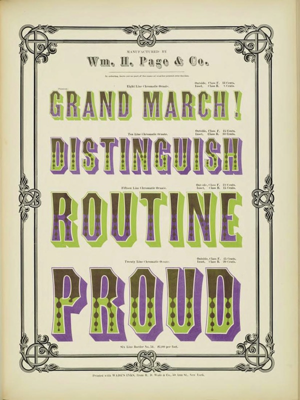
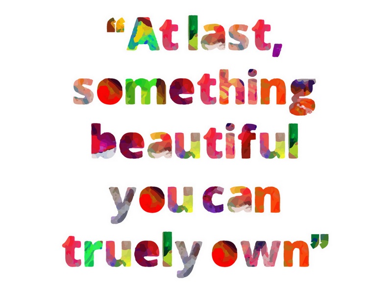
Fortunately, with the advent of “multi-color” fonts, we are one step closer to seeing letters in a decorative and aesthetic form that could perhaps only be achieved with color. As I said above, the only reason fonts were initially made “black and white” was because it was not technically possible to make them in color. Later, everything that was black and white became colored, such as cameras and televisions. The world around us is also colored, and so is the web. The only thing that remained colorless was the font, which finally gave up!