Translated by Google. I’ll be revising and editing all Blog posts soon.
In Persian mythology and epics, and Ferdowsi’s Shahnameh, Kaykhosrow is the son of Siavash and Farangis, and the grandson of Kaykavous and Afrasiab. The word Kaykhosrow means “King of good name.” Kaykhosrow remains a just and brave king. In the Shahnameh and Pahlavi texts, Kaykhosrow is a symbol of an ideal king.
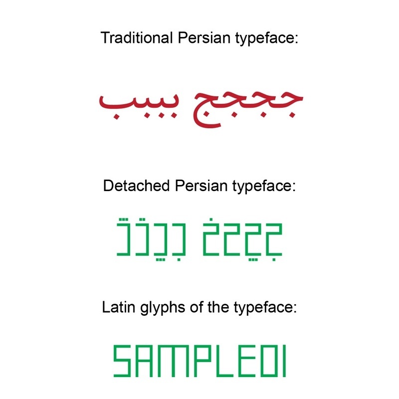
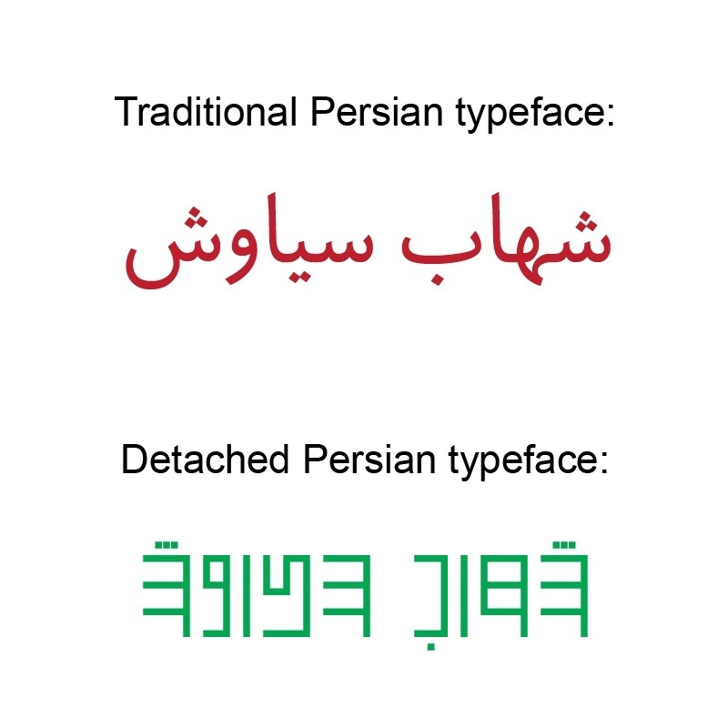
We have all seen the obvious differences between Latin and Persian/Arabic letters. A difference that, due to the structure of Persian cursive and Latin non-cursive letters, seems to have created two completely different worlds. One with vertical letters that are almost equal and spaced equally, and the other with letters that constantly jump up and down on the baseline and are not calm and steady. Their thickness and writing methods are also different. When we use these two alphabets simultaneously in graphic design or typography projects, the letters do not fit together and do not create a proper visual connection. But we had accepted this, until now! Because there was no other way!
So I decided to think about this situation from a typographic perspective. It is worth mentioning here that the initial idea for this type of font, dates back to 2006. But that version only had 2 weights, plain and bold, and there was no Latin letters. At that time, I had come to the conclusion that the final solution was to simply change the letters of the Persian alphabet. So these steps were taken to create a completely identical structure in the Persian and Latin letters of this font family:
- Removing the connection and cursiveness between Persian letters. As we know, all Persian letters, except for a few, must be connected to be read and written. To do this, I designed the letters vertically and separately.
- To accomplish the above, it is necessary to design the letters from scratch. All the letters in these fonts have been redesigned. In some cases, the height of the letters needed to be increased to match the height of the Latin letters, and in other cases, there was no choice but to rotate and convert the letters from their original shape. These changes have been made in a way that, in the my opinion, will make the text easy to read for a Persian/Arabic-speaking reader after a little practice.
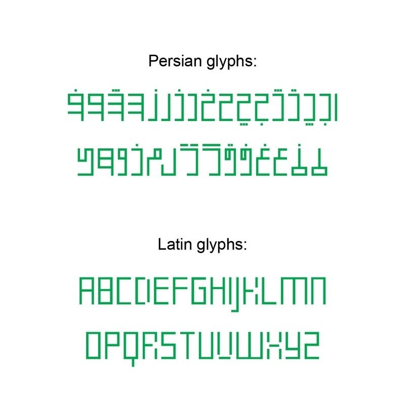
- After completing the above steps, there is no longer a need for 2 or 4 different forms for each letter. I have previously written in some of my articles that in Persian/Arabic Alphabet we have 2 initial and final forms for each letter. But in Persian/Arabic Fonts it was decided from the very beginning to have up to 4 different forms for each letter, for example for “گ” it is (كـ, ک, ـكـ and ـک). These four forms are called Initial, Medial, Final and Isolated. So by removing unnecessary forms, this font now functions completely like a Latin font.
- And finally, based on a geometric typographic decision, I decided that all the letters in these fonts should be designed to be as equal in height as possible, without any broken angles. There are no angles between 0 and 90 in any of the letters in KayKhosrow fonts. To do this, even some Latin letters have undergone changes, such as K, R, V and X.
- On top of all that, this font family comes in 12 different styles! These weights and styles are: 1-6: Kaykhosrow (Regular, Italic, Bold, Black, Italic Bold and Italic Black) 7: Kaykhosrow Oblique 8: Kaykhosrow Outline 9: Kaykhosrow Round 10: Kaykhosrow Smooth 11: Kaykhosro Inline .12: Kaykhosrow Pure Persian
Pure Persian
Style number 12, Kaykhosrow Pure Persian, actually does 2 changes to the Regular version of the font:
1- Removing letters with Arabic roots and replacing them with letters that have Persian roots. 2- Converting Latin letters to phonetic letters, so that all Persian speakers can write Persian in Latin letters, even if they do not have access to a Persian keyboard. Of course, this is a bit unlikely at this time, but anyway, this is also a special function of version number 12.
This has only been applied to the Pure Persian version of Kaykhosrow font, and the other 14 versions contain all the basic Arabic and Latin letters.
In fact, in this version, the letters “ح, ث, ذ, ض, ع, ق, ص, ط, ظ” have been deleted and replaced with Persian consonants. Also, changes have been made to the Latin alphabet so that all Persian letters that are not available in Latin can be written with them. For example, the English letters Q, U and X are pronounced as و ,غ, and خ, respectively, and there are some new letters with slight changes to the basic English letters (like those seen in the Latin alphabets) to provide alternatives to ژ ,ش, and چ.
Stylistic Alternates
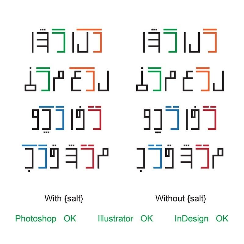
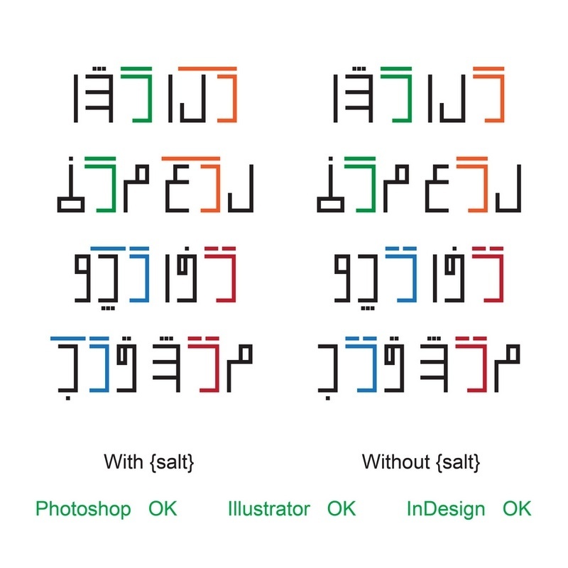
Two versions of these 12 styles, namely Kaykhosrow Regular and Kaykhosrow Pure Persian support {salt} or Stylistic Alternates. These alternative glyphs are applied in some complex and specific situations. In order for the letters “Long Kaf” and “Long Gaff” to appear, special letters that do not have a dot above must come after “Kaf” or “Gaf”. It is also necessary that the Stylistic Alternates option is enabled in the software (such as Adobe Photoshop, Illustrator, InDesign, etc.). There is an interesting discussion with font design masters and experts about this on the type designers heaven site TypeDrawers, which is worth reading.
And that’s not all!
As I wrote somewhere in the post, this font family has 15 different styles, and we have only introduced 12 versions so far. The remaining versions include 3 versions of KayKhosrow Colored fonts.
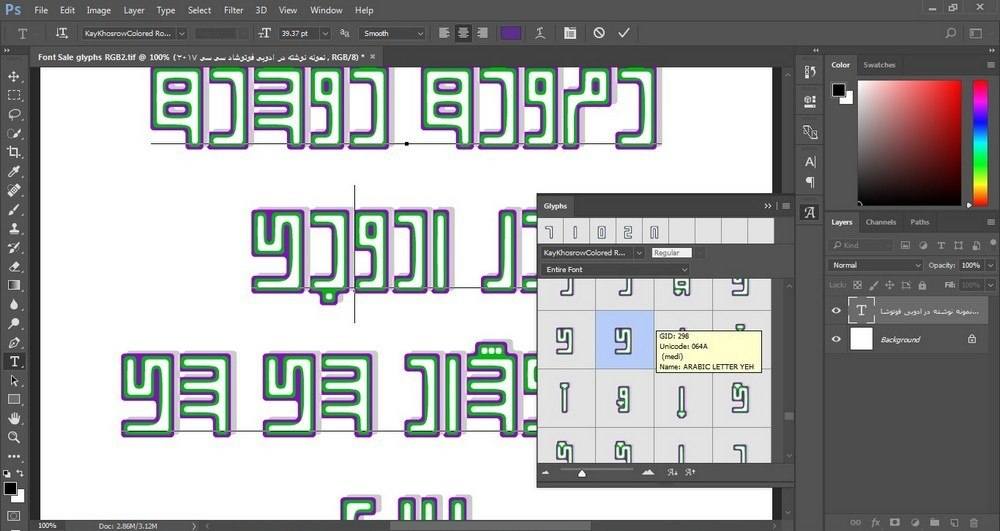
5 layers of color on top of each other: KayKhosrow font family has 3 colored versions: 1- Round 2- Distorted 3- Glowed
And each of the glyphs in these 3 versions consists of multiple layers, as can be seen in the image below:
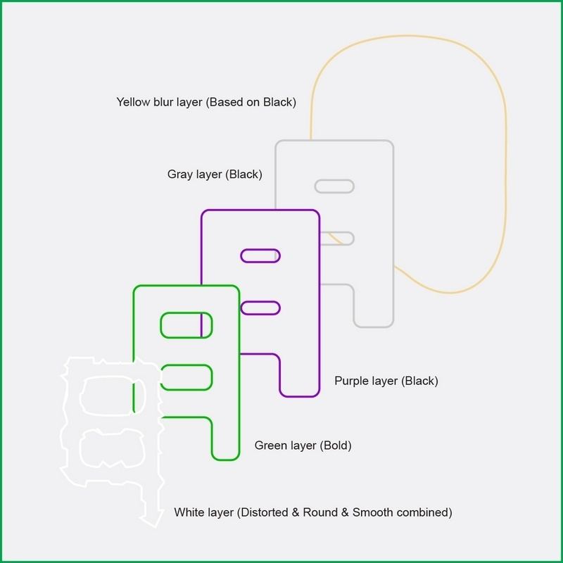
- The white layer, which in the round version is the same as the usual Kaykhosrow, and in the other two versions is a mixture of sharp, simple, and soft versions.
- The green layer, which is the same as the Bold KayKhosrow version.
- The purple layer is the same as the Black KayKhosrow version.
- The gray layer, which is the same as the Bblack KayKhosrow version, is slightly spaced out and acts as a shadow for the letters.
- The yellow luminous layer, which is a blurred version with a very high radius is based on the Black KayKhosrow version and acts as a backlight. This layer is only found in the KayKhosrow Glowed